
Compare Teams Report
The Compare Teams report enables the comparison of the performance of multiple teams in the contact center. Comparing teams in this way enables managers to target groups that deserve praise or require improvement. The report drills from the team level down to the agent level (as well as question level) to determine root causes. This report is commonly used by contact center managers to gain a holistic as well as a comparative overview of their teams.
Setting Up a Report
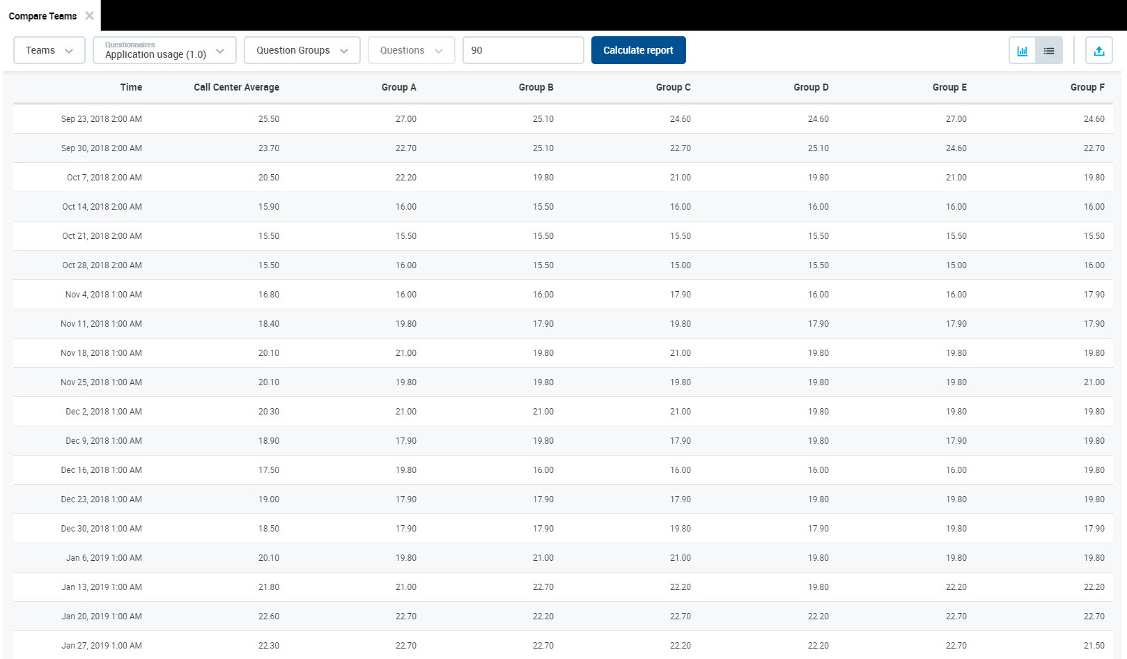
The report allows the user to select a questionnaire, a question group or even a particular question, and view the results for all available teams as a time-series graph. It is also possible to select a specific team and view its particular results only.
To compare teams:
Select Reports > Compare Teams from the left-hand menu. The Compare Teams screen will open.
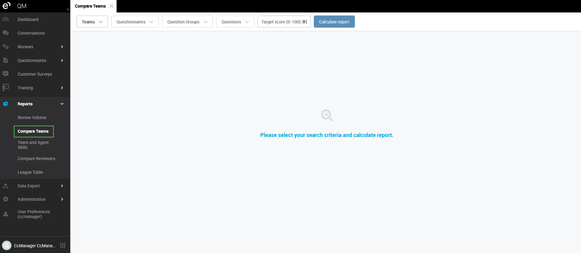
Follow the steps to set up the Compare Teams report:
Select a team from the Teams drop-down menu to create a report based on the specific team/teams (optional). Do not select any team if you would like to compare results for all available teams.
Select a questionnaire from the Questionnaires drop-down menu (mandatory).
Select a question section from the Question Groups drop-down menu to create a report based on the specific question group/groups (optional).
Select a question from the Questions drop-down menu to create a report based on the specific question/questions (optional).
Optionally enter a Target score (0-100) in percent. A line on the report will appear, clearly indicating the target score.
Click Calculate report. The Compare Teams report will display.
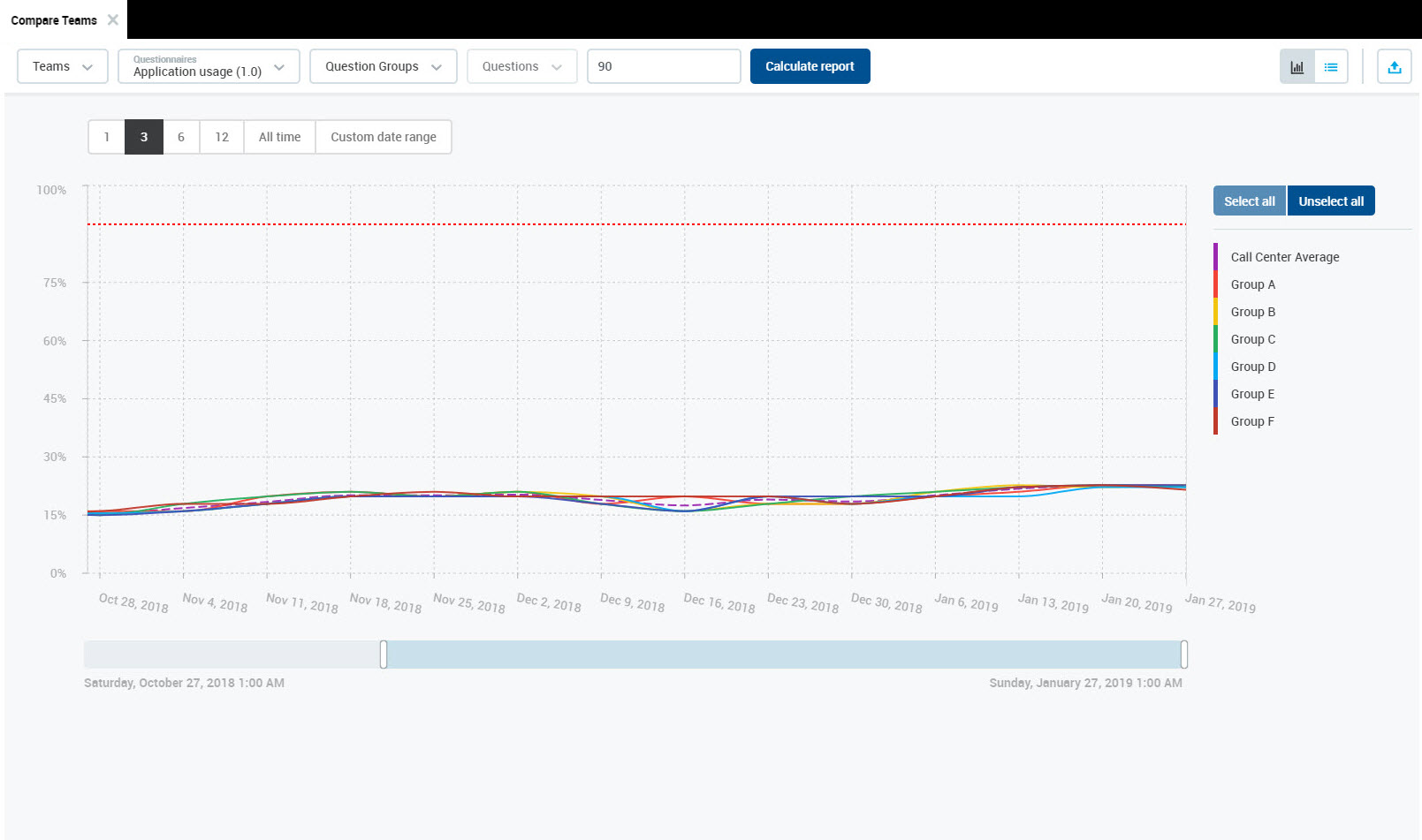
If no teams are selected in the Teams drop-down menu, the chart represents results for all available teams. Selection of a questionnaire is mandatory.
Hover the mouse cursor over the chart to view details. A tooltip with details for the selected point in time will appear.
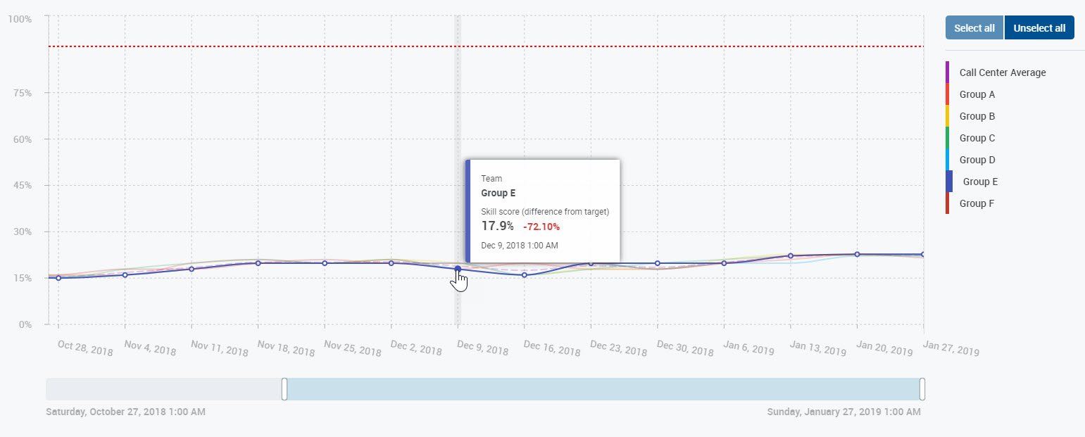
The tooltip contains the following information:
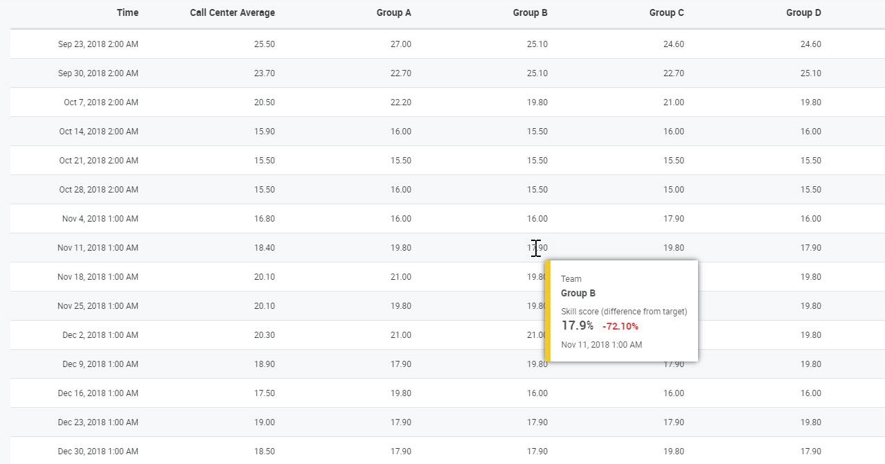
Team – name of the selected team
Skill score (difference from target) – score for the selected questionnaire (if the target score was configured, the percentage difference between the received score and the target score will be displayed in red color)
Date – selected point in time
Setting a Date Range
By default, the report displays the last three months. The date range displayed can be modified using the time period selector at the top of the report screen.
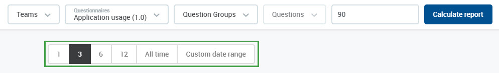
Click a different date range (one, six or twelve months) to view a shorter or longer time period. Select a shorter range if the reviews are close together in time or a longer range if the reviews are further apart in time. It is also possible to select All time to display all available data.
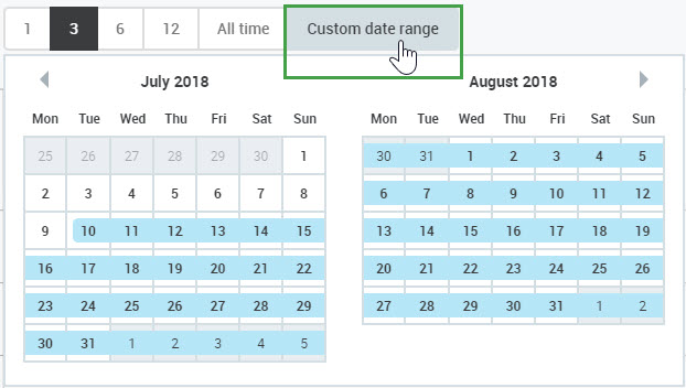
To define a custom date range, click the Custom date range button. A calendar will display. The currently selected date range is highlighted in blue.
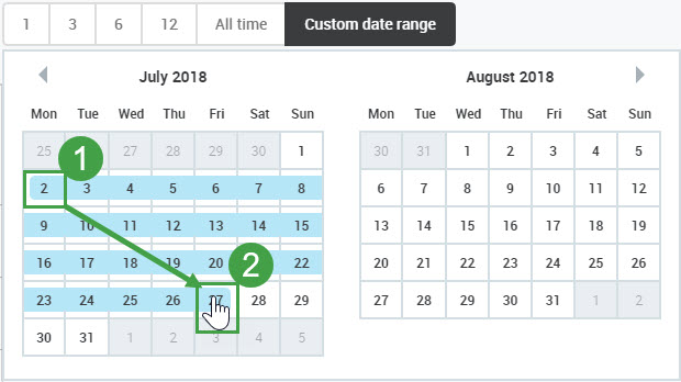
Click on the calendar to select the first day of the custom date range. Then click on the calendar to select the last day. The selected date range will be highlighted in blue.
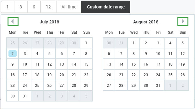
Use arrows at the top corners to go to the previous/next month.
Alternatively, change the date range using the date range scale bar at the bottom of the report screen. The date range scale bar displays all data available from when the questionnaire was first used. The default date range shows the last three months of data.
Click inside the highlighted area to drag and move the defined date range.

Drag the bar to extend or shrink the date range.

The time displayed corresponds to the timezone of the current user. Not necessarily the server timezone.
How does Time period affect what is displayed?
Period To as defined in the Review criteria is used as the decisive date when a Review score is shown in the report/chart.
However:
For Reviews created by the Review Scheduler, then Period To as defined in the Review criteria is used as the decisive date when a Review score is shown in the report/chart.
For Reviews created directly from the Conversation Explorer the date when the conversation happened is used as the decisive date when a Review score is shown in the report/chart.
Switching Between Views
To switch between Chart and Table views, click on the Chart (


The Table view contains data used to generate the chart. The same data is exported to Excel upon export.
Hover the mouse cursor over the table to view details. A tooltip with details for the selected item will appear.
Drilling Down
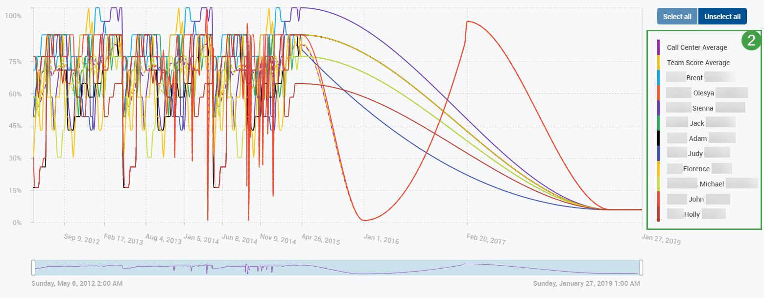
Click on any point in time on the line to drill down.
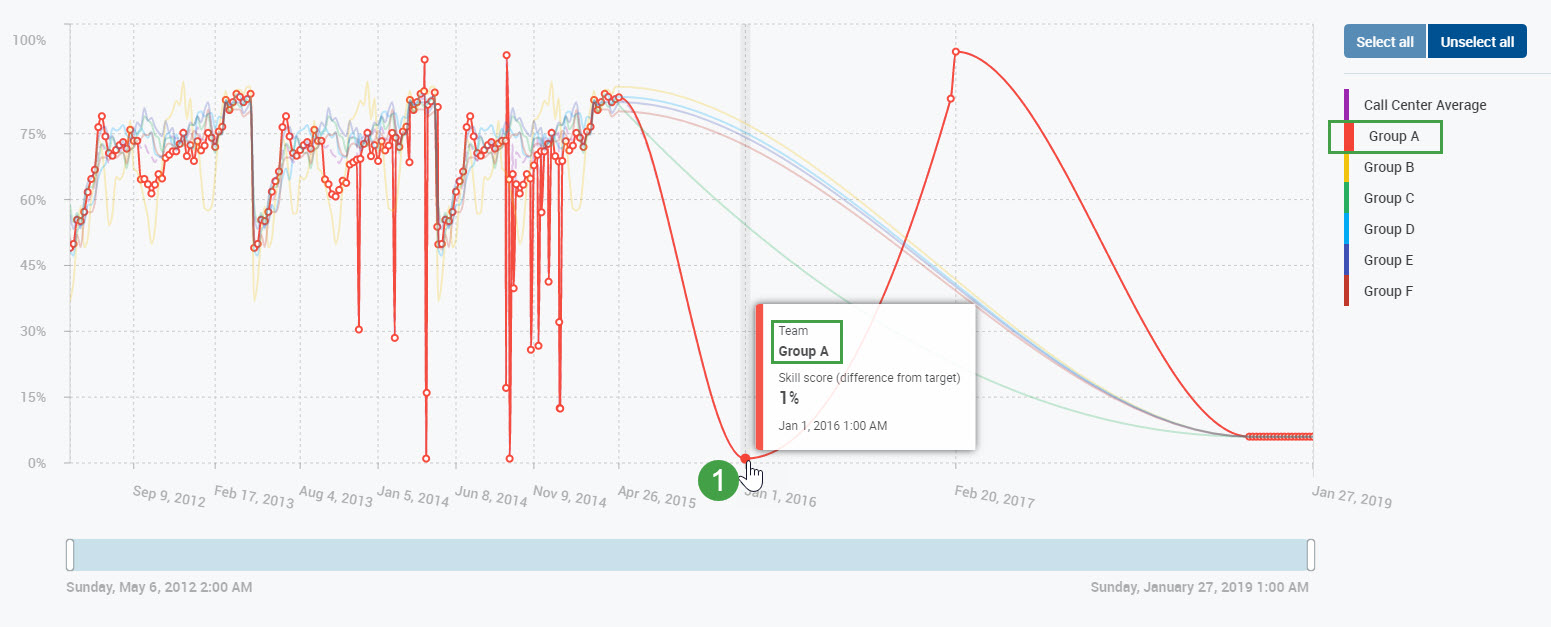
The report will display the results of the individual members of the selected team. Individual lines on the chart will represent the scores of each agent for the selected questionnaire, question group or question. The dotted lines represent the call center average and the team score average. Team members displayed are listed in the legend.
After drilling down, the view can be switched between Graph and Table view if needed.
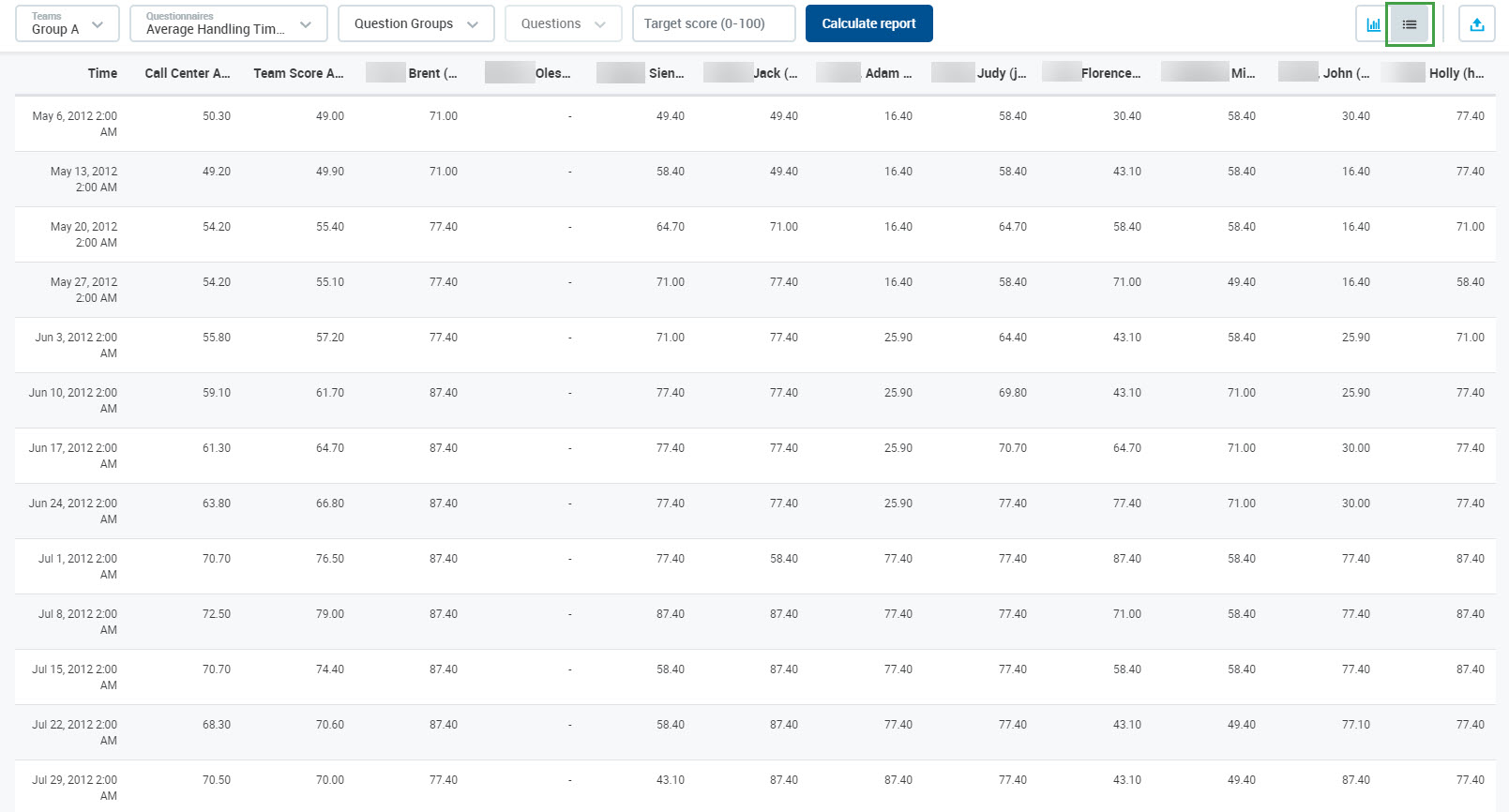
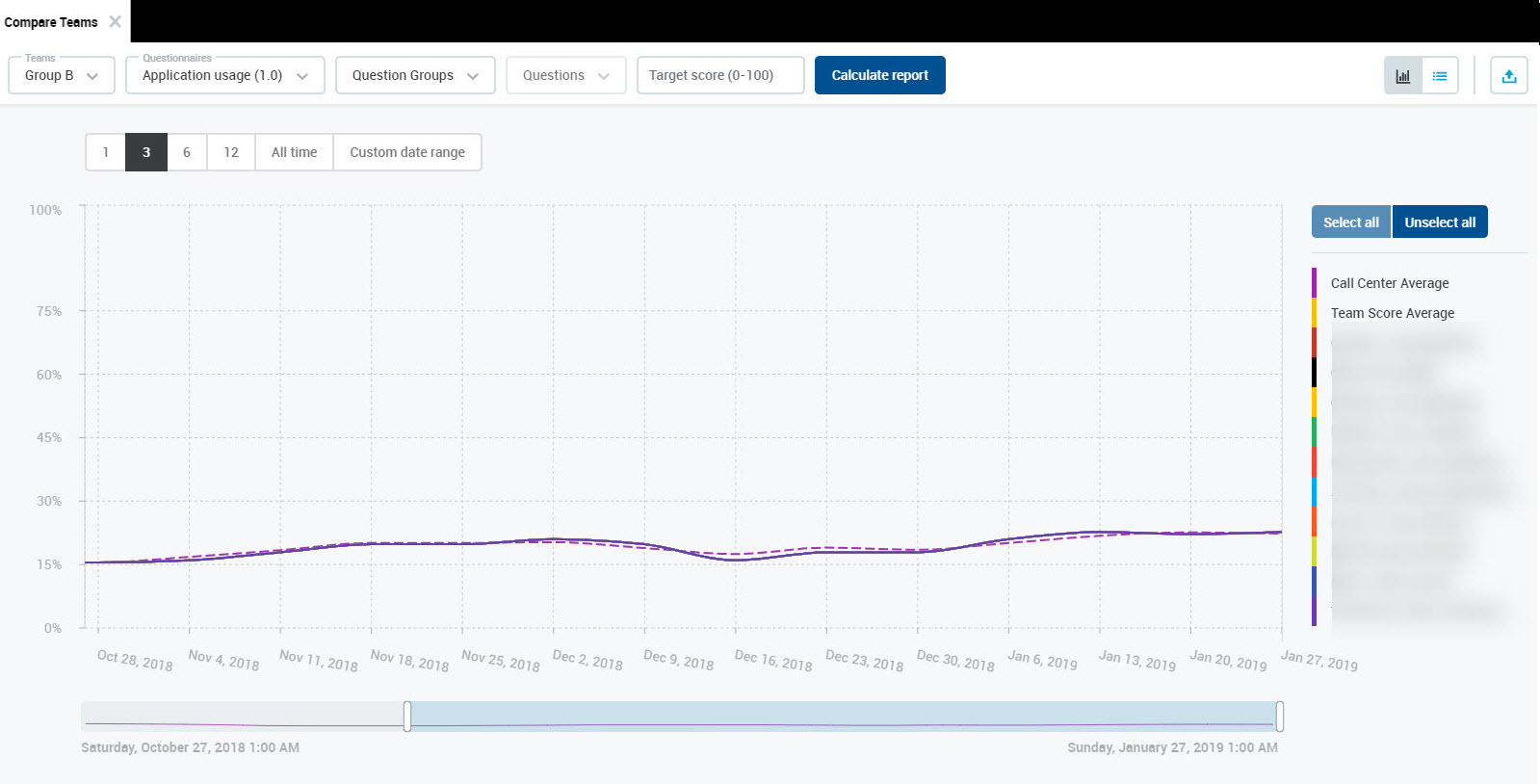
Team Score Average
Note that after drilling down or after selecting a particular team, a new parameter is calculated: Team Score Average.
Based on the way that the reviews were planned, the Team Score Average can be calculated in the following ways:
if the reviews were completed during the review period planned by Scheduler, the Time value in the table represents the end date of the review period (the "To" date) and the average is calculated from all reviews completed during this period
if the reviews were completed "ad-hoc" from the Conversation Explorer, the Time value in the table represents the date when the reviewed call has happened and the average is calculated from all completed reviews of calls which happened on that day
In both cases: if only one agent was evaluated during the period/on that day, the Team Average Score will be the same as the review score.
Click on an agents' line to drill down again.
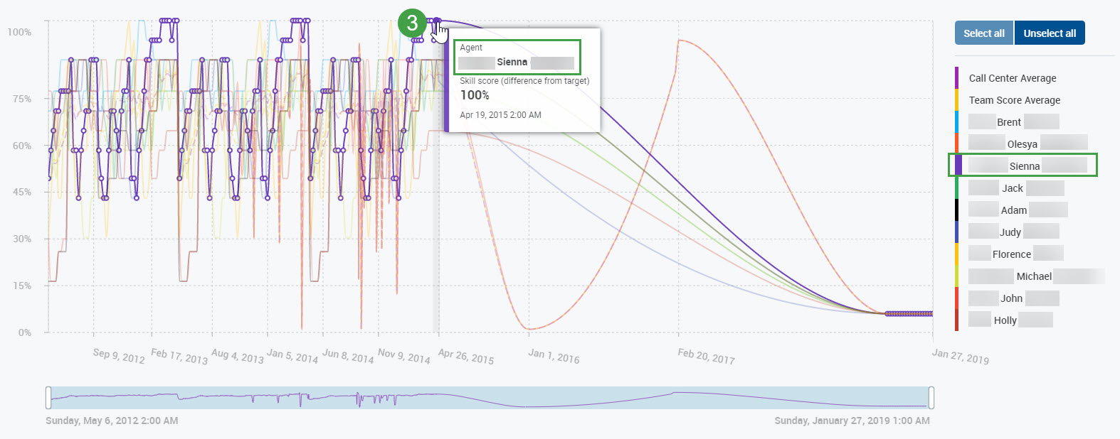
The Team and Agent Skills report will open, showing the question groups results for the selected agent. Additionally, the question groups will display within the legend to the right of the report screen.
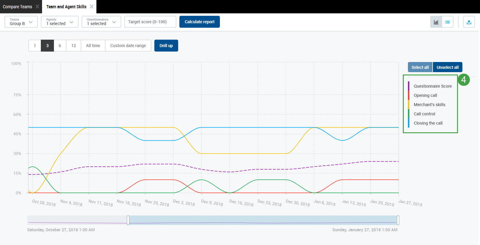
Read more about how to use Team and Agent Skills Report.
Selecting Individual Results
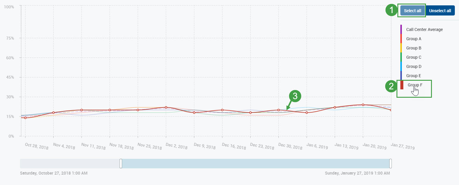
The legend initially shows all available teams (if no team was selected at the beginning). After drilling down, it shows all agents which are members of the selected team.
Click on a particular legend item to unselect it. The unselected items appear in gray on the legend and disappear from the chart. Click any grayed-out item to select it again.
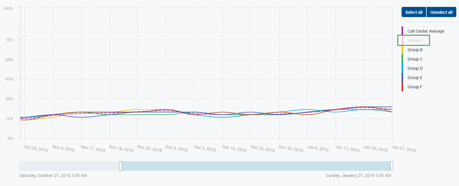
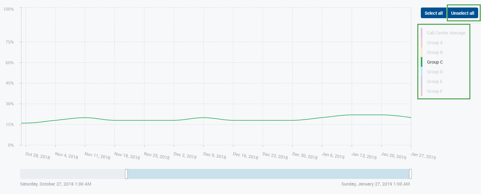
Click Unselect all to gray out all items. Then click on the individual item or items to display on the chart. Click Select all to display all items again.
Another way to display individual results is by highlighting:
Ensure that the Select all option is selected.
Hover the mouse over the legend item that should be highlighted.
The line representing the selected item will remain on the chart. The rest of the items will be grayed out.
Exporting Data
To export the report as an Excel spreadsheet, click the Export button.

A notification about the planned download will display at the bottom.
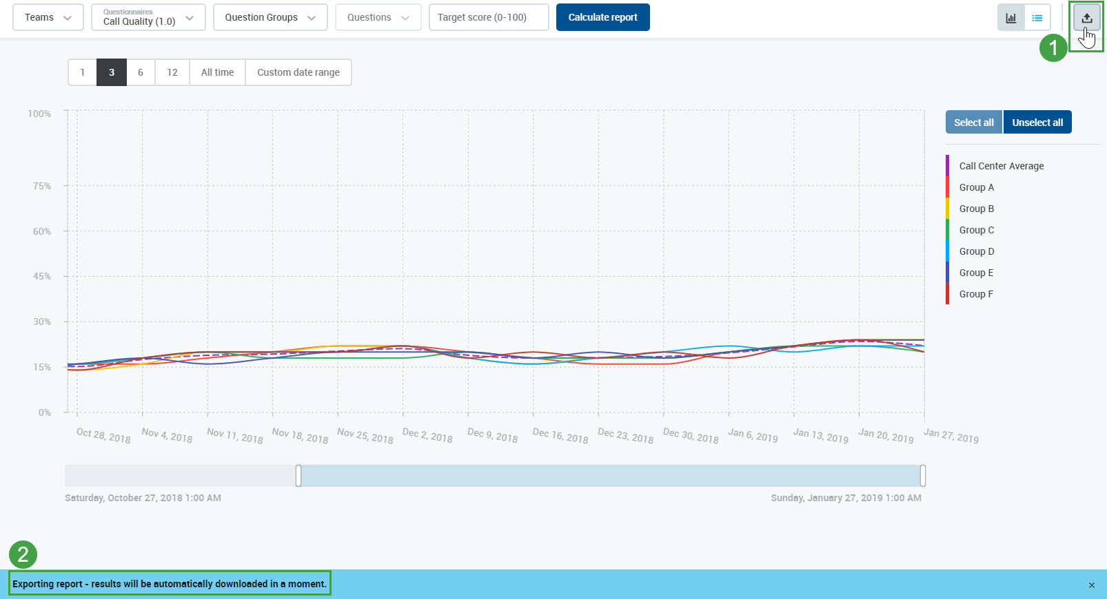
The exported file contains all of the currently displayed data with date range filters applied.
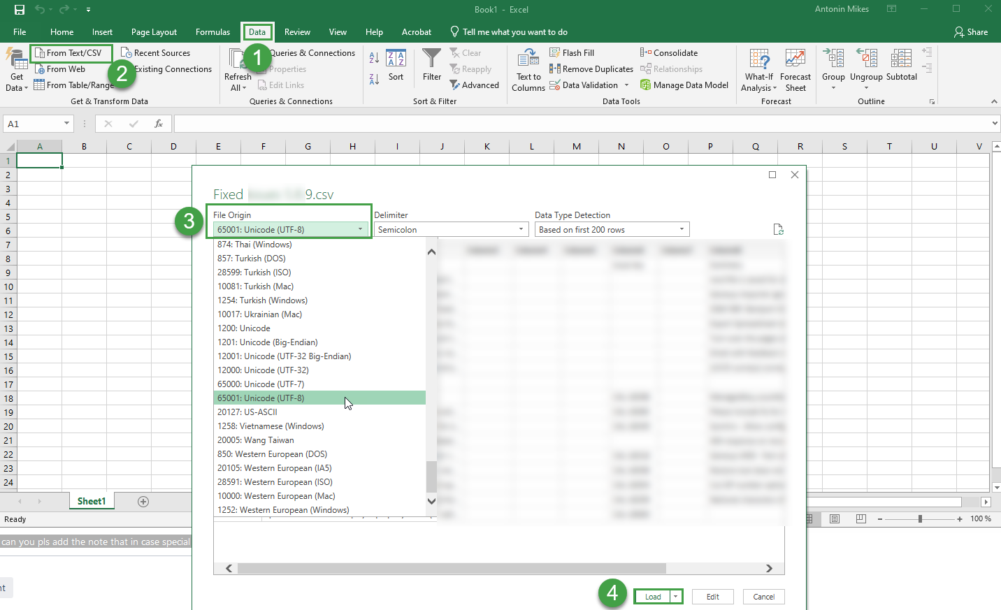
If you use international characters in your reports these special letters/characters may not display properly in MS Excel. If letters or characters do not display as expected, please switch encoding in Excel to UTF. To do this open a new excel file and go to Data → Import from the text.
Open Microsoft Excel
Go to the Data Tab
Click on the From Text/CSV icon.
Navigate to the location of the file that you want to import and import it.
Select the file type that best describes your data from the File Origin dropdown menuSelect Unicode (UTF-8)
Click Load
Changing Initial Drop-Down Values
It is possible to change initial drop-down values (for example select a different team, questionnaire, questions etc.) at any time. This change is indicated by a red exclamation mark on the Calculate report button.

Click the Calculate report button to recalculate the report again using new values. A new report will display.
Note that after changing initial drop-down values, but before clicking the Calculate report button to recalculate, it is not possible to export data, drill down or drill up the report and a warning message is displayed.
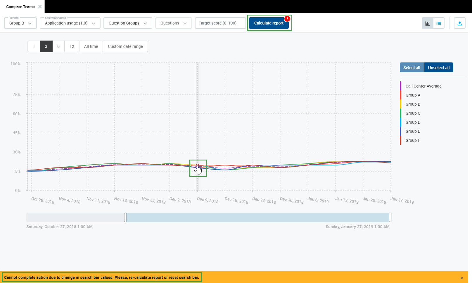
Click Calculate report to apply changes or reset changes to be able to export, drill down and drill up.