Compare Reviewers Report
The Compare Reviewers report provides an overview of how multiple reviewers scored a single agent. This report is used as a calibration tool and visually depicts how multiple reviewers vary in scoring specific questionnaires so it can be quickly determined if the review team is assessing quality-management scores similarly. The standard deviation is provided to ensure accuracy. It is also possible to drill down to question groups and identify gaps at this level.
Setting Up a Report
To set up the Compare Reviewers report, go to Reports > Compare Reviewers in the menu on the left of the screen. The Compare Reviewers screen will open.

Follow the steps to set up the Compare Reviewers report:
Select a team from the Teams drop-down menu (mandatory).
Select an agent from the Agents drop-down menu (mandatory).
Select a questionnaire from the Questionnaires drop-down menu (mandatory).
Click Generate report. The Compare Reviewers report will display.
How does Time period affect what is displayed?
Period To as defined in the Review criteria is used as the decisive date when a Review score is shown in the report/chart.
However:
For Reviews created by the Review Scheduler, then Period To as defined in the Review criteria is used as the decisive date when a Review score is shown in the report/chart.
For Reviews created directly from the Conversation Explorer the date when the conversation happened is used as the decisive date when a Review score is shown in the report/chart.
Selection of all fields is mandatory.
Drilling Down the Levels
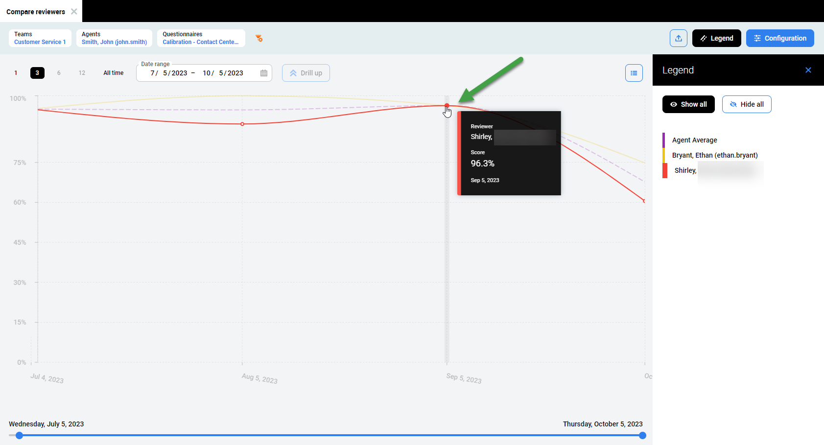
Click on any point in time on the line to drill down.
Hover the mouse cursor over the chart to view details. A tooltip with details for the selected point in time will appear.
The tooltip contains the following information:
Reviewer – name of the pointed reviewer
Score – score for a selected questionnaire
Date – selected point in time
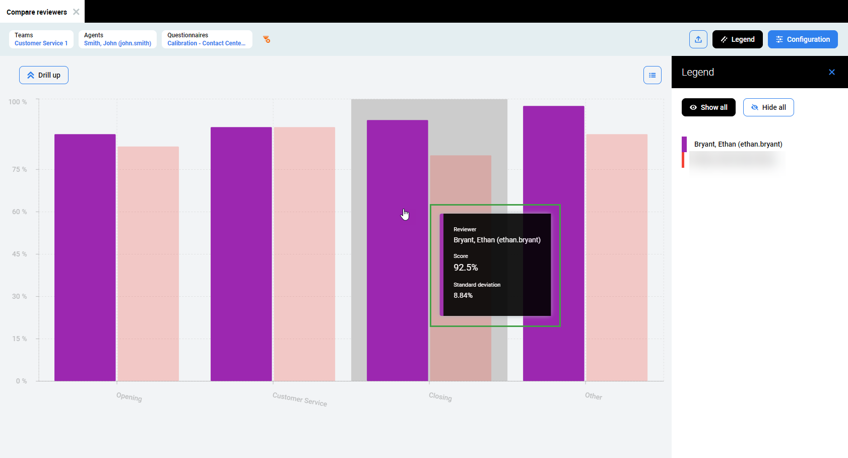
As you drill down information displayed will change. Bars on the chart will represent the scores received from particular reviewers for each questionnaire section.
If data is available more information may be visible. Drill down (click) to view additional data.
Additional data may include:
Time range – using Start date and End date fields at the top of the screen. Modify Start and/or End dates to display the average result for the selected time period.
Scores – Bars on the chart will represent scores for each question belonging to the selected questionnaire section.
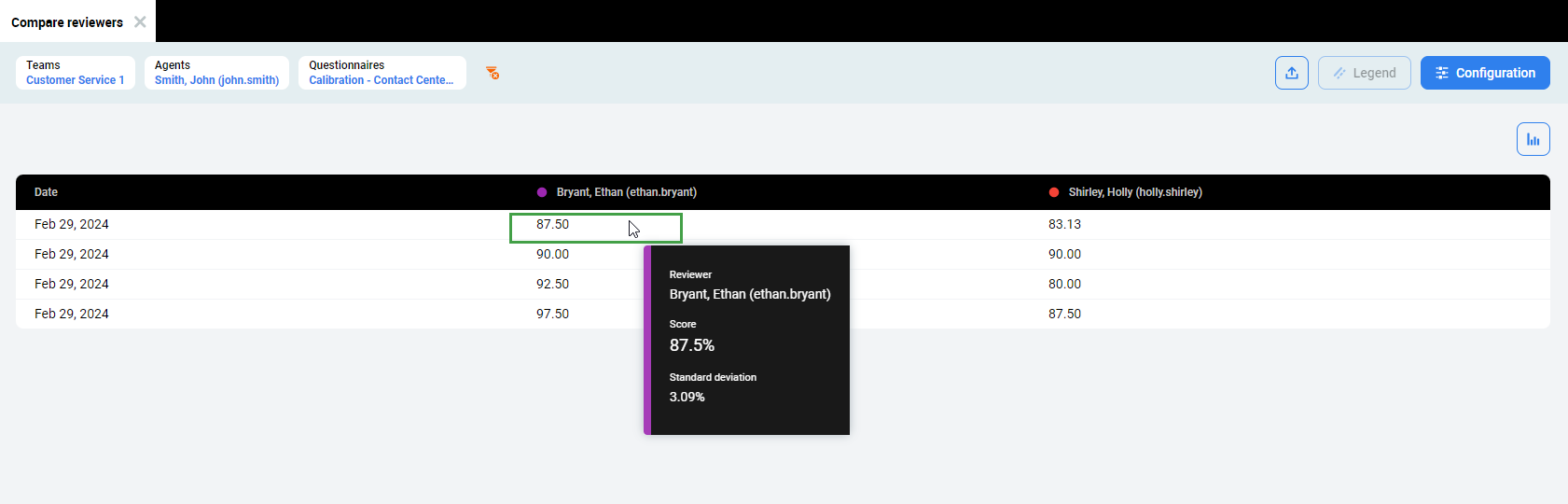
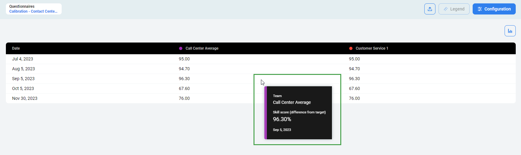
Table View
It is also possible to change the view after drilling down. The Table view contains data used to generate the chart. Hover the mouse cursor over the table to view details. A tooltip with details for the selected review results will appear.
If it is not possible to drill down again, a notification will appear at the bottom of the screen, indicating that this is the lowest level possible.
Universal settings
Setting a Date Range
By default, the report displays the last three months. The date range displayed can be modified using the time period selector at the top of the report screen.
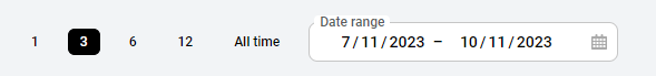
Click a different date range (one, six or twelve months) to view a shorter or longer time period. Select a shorter range if the reviews are close together in time or a longer range if the reviews are further apart in time. It is also possible to select All time to display all available data.
To define a custom date range, click the Date range button. A calendar will display. The currently selected date range is highlighted in blue.
Click on the calendar to select the first day of the custom date range. Then click on the calendar to select the last day. The selected date range will be highlighted in blue. You may also enter the dates manually at the top.
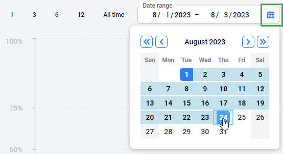
Use arrows at the top corners to go to the previous/next month.
Alternatively, change the date range using the date range scale bar at the bottom of the report screen. The date range scale bar displays all data available from when the questionnaire was first used. The default date range shows the last three months of data.
Click and drag the bar to move the defined date range.

Drag the end of the bar to expand or shrink the date range.

The time displayed corresponds to the timezone of the current user. Not necessarily the server timezone.
How does Time period affect what is displayed?
Period To as defined in the Review criteria is used as the decisive date when a Review score is shown in the report/chart.
However:
For Reviews created by the Review Scheduler, then Period To as defined in the Review criteria is used as the decisive date when a Review score is shown in the report/chart.
For Reviews created directly from the Conversation Explorer the date when the conversation happened is used as the decisive date when a Review score is shown in the report/chart.
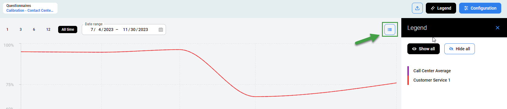
Switching Between Views
To switch between Chart and Table views, click on the Chart or Table icon at the top right corner of screen.
The Table view contains data used to generate the chart. The same data is exported to Excel upon export.
Hover the mouse cursor over the table to view details. A tooltip with details for the selected item will appear.
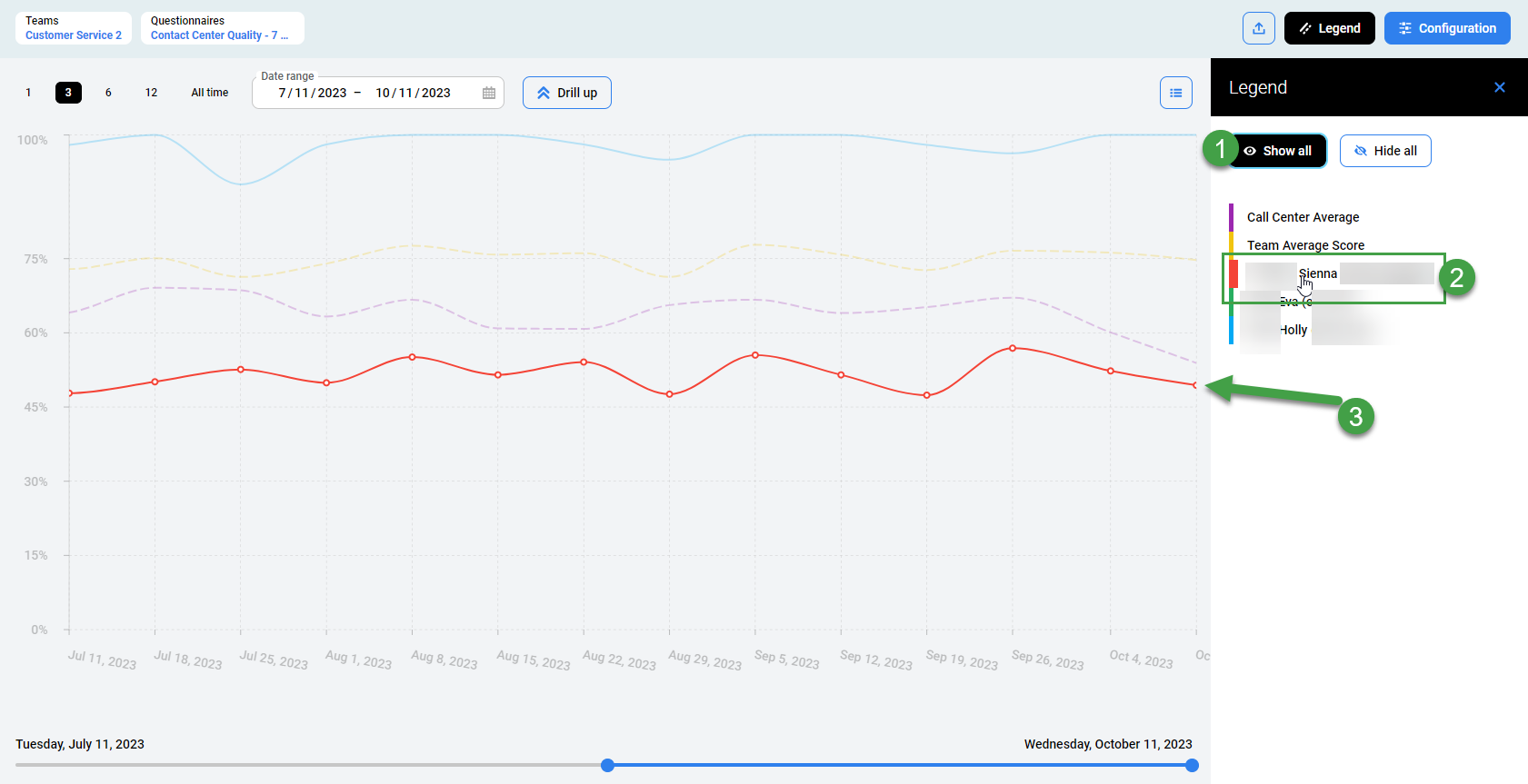
Selecting Individual Results
The legend initially shows all available teams (if no team was selected at the beginning). After drilling down, it shows all agents which are members of the selected team.
Click on a particular legend item to unselect it. The unselected items appear in gray on the legend and disappear from the chart. Click any grayed-out item to select it again.
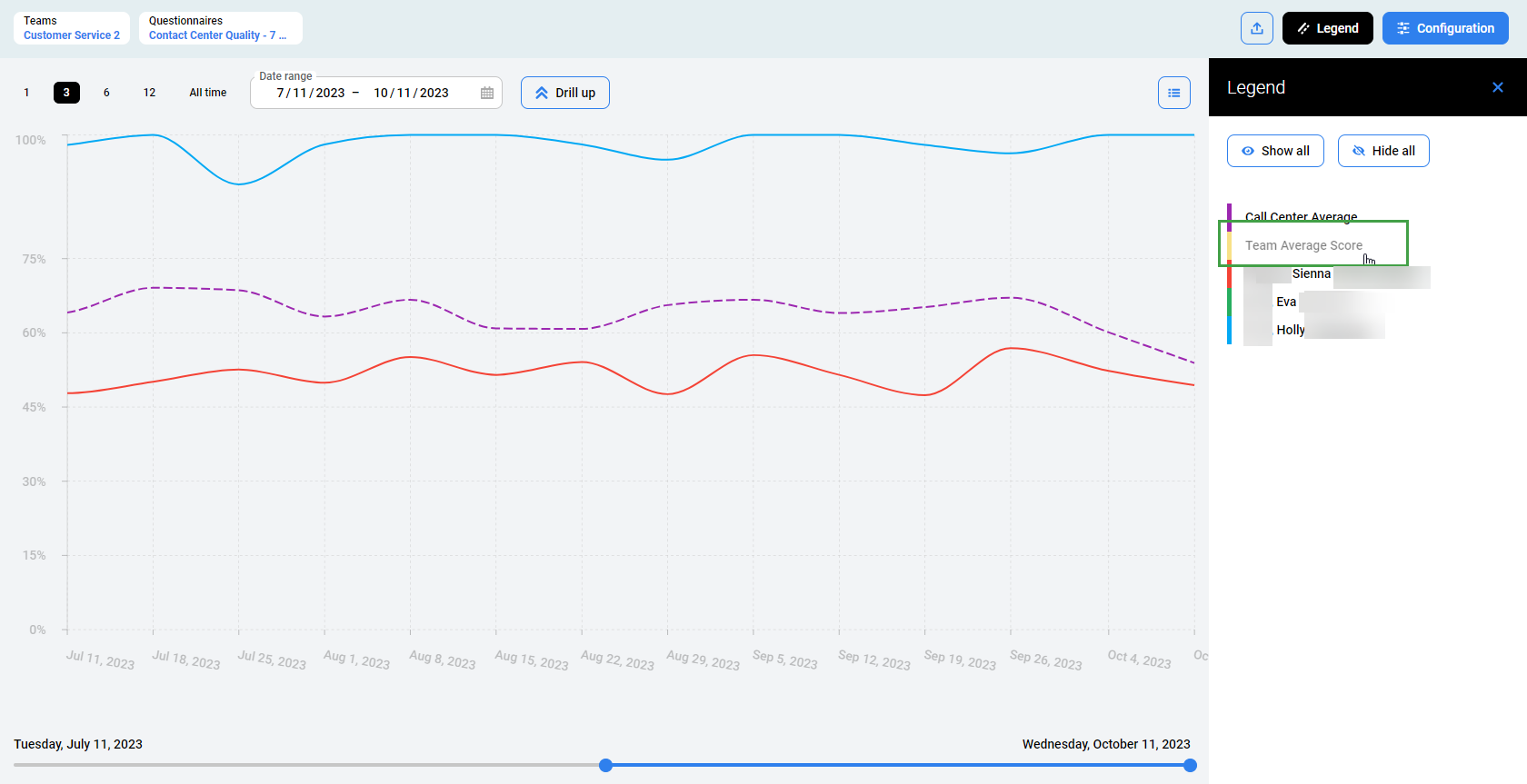
Click Hide all to gray out all items. Then click on the individual item or items to display on the chart. Click Hide all to display all items again.
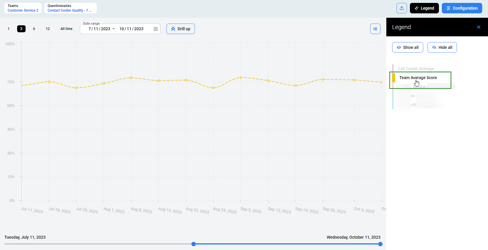
Another way to display individual results is by highlighting:
Ensure that the Show all option is selected.
Hover the mouse over the legend item that should be highlighted.
The line representing the selected item will remain on the chart. The rest of the items will be grayed out.
Exporting Data
To export the report as an Excel spreadsheet, click the Export button.

The download will begin.
The exported file contains all of the currently displayed data with date range filters applied.
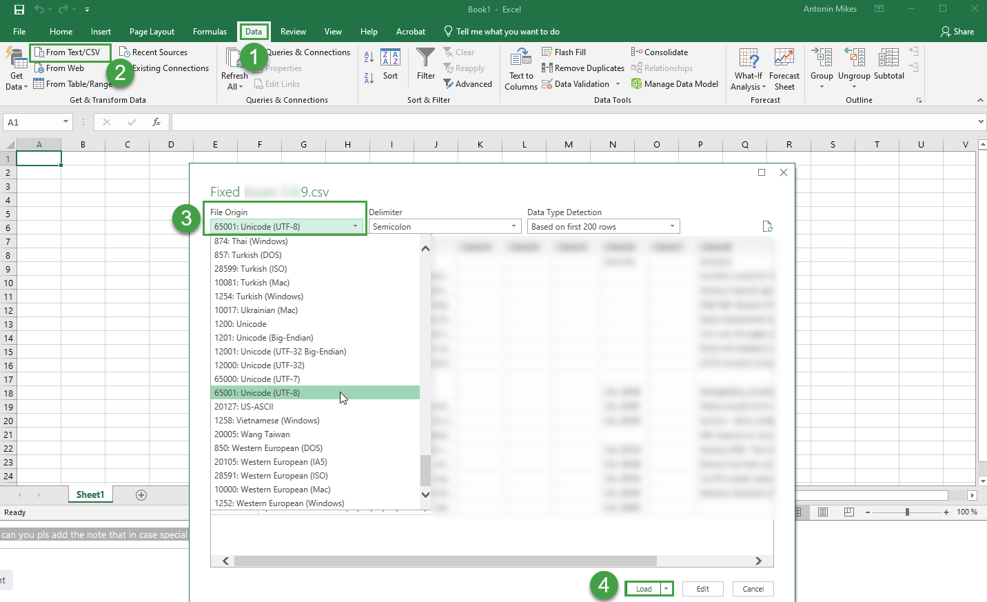
If you use international characters in your reports these special letters/characters may not display properly in MS Excel. If letters or characters do not display as expected, please switch encoding in Excel to UTF. To do this open a new excel file and go to Data → Import from the text.
Open Microsoft Excel
Go to the Data Tab
Click on the From Text/CSV icon.
Navigate to the location of the file that you want to import and import it.
Select the file type that best describes your data from the File Origin dropdown menuSelect Unicode (UTF-8)
Click Load